
Project
Checkout process for confidential brand
Duration
4 weeks
Deliverables
Research, User Flow, and Wireframing
Tools
Figma
Project Brief
This project’s old flow had a 16-step checkout process, which has now been shortened to 5 phases to make it easier for users. It focuses on displaying just a few steps at a time. By connecting with different teams to identify pain points, I ensured that the new steps are clearer for users and include helpful features like autofill, smart suggestions, and real-time error checks. Additionally, simple instructions, tooltips, and a guest checkout option make the process smoother and more user-friendly, especially for new customers.
The process
Research
Define & Ideate
Information Architecture (IA)
Wireframing
Stage in Customer Journey
What do we want the user to do next and how do we nudge them to take action.

Some of the old checkout steps
Sharing some of the old designs to highlight the improvements made in the updated version.

Updated Checkout Design

2
1
3
4
5
1
Gather all label questions, such as size, material, and version, in one view to create a smoother user experience.
2
Added tooltips to clarify features and explain terms, helping users make informed decisions without cluttering the interface.
3
Included a downloadable dieline option for users to reference.
4
The version and quantity indicate whether the number is incorrect or less than the minimum quantity required to order.
5
Added the overall order summary at the beginning to give users a clear idea.

1
1
If the user saves the quote, show all the options they selected as a summary in a popup, and then it will be sent to their email address.

1
2
3
1
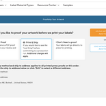
When users choose 'printed proof,' the shipping options appear immediately, prompting them to add their address information.
2
While adding artwork, the progress bar indicates how many more the user needs to add and ensures that the individual version quantities are included so they don’t miss these key steps.
3
Displays an instant preview of each individual version.

1
2
1
Added an option for users to include specific instructions.
2
Previously, users could only see one version image, which led to a lot of rage clicks (frustration clicks). To address this issue, I added a preview feature that allows users to see all the versions.

1
1
Users can preview all the versions they uploaded in this popup. I also added a zoom option to check the details of the design.

1
1
Users stay in the checkout flow to choose their path: guest, login, or sign up, rather than being taken to a whole new page for the sign-in process.

1
2
3
1
In the shipping method, users can choose either shipping or pickup based on their selection.
2
In the payment section, I added additional features, including a purchase order (PO) option. To use this PO feature, users must connect with customer service for access.
3
In the order summary, users can see all the options they have selected, including any special instructions, which makes it easier to review and finalize the purchase.


