

Duration
4 weeks
Deliverables:
Wireframes, Prototype, Wireframe kit
Tools:
Sketch, Illustrator & InVision
My role
Research, Player flows, Sketching, Wire framing, Branding, Prototyping, User interviews, User interface design, Illustration.
For
Client project UX/UI
A platform for the fashion apparel industry that uses artificial intelligence.
Overview
Neural Trend wanted support in making the platform's overall structure understandable and easy to navigate. The goal is to create a better user experience that allows time-crunched executives to quickly get the information they need.
Process
We used the process of Double Diamond with user & SME testings, did additional research thereby being able to create three divergent approaches and then combined it into one final prototype. We started with interviews conducted for NeuralTrend employees, merchandisers & vendors.

Interview (Round 1)

Interviewee: Andy Ng | Product lead
Interviewers: Max, Flavia & Mike
Totally for this 1st round, we interviewed 6 users and 4 SMEs. We got a lot of important insights from their responses added below.
Let’s start with some interesting quotes from our users.
“Our North Star user is definitely the retailer buyer and planner.”
- Andy, Product manager at Neural Trend
"From a planning perspective, the biggest thing is having the ability to manipulate."
- Janice, Omni merchandiser at Ann Taylor Inc.
We grouped together and summarized our interview below:


Our team worked Remotely in Miro
-
Aligns naturally with their order of decision-making
-
Makes data manipulation intuitive
-
Reduces cognitive load
-
Makes it easier to complete their tasks
-
Lends confidence to decision-making
We came to the conclusion that users need information organized in the following ways:
The following are the points that the users want:
-
Reduced cognitive load
-
Easier task completion
-
Confidence in decision-making
With all this information, we moved forward with ‘Competitive analysis’ and also evaluating language and messaging, target audience, the platform features, design patterns, information organization & customization.
Competitive analysis

Competitive analysis was a bit tricky for us because all the brands were highly confidential and it was only available for their real clients so we started searching from every possible availability, even screenshots helped us to understand what's unique with each brand.
Finally, we found out our competitors’ main strengths
-
Customer can choose to sign up to all solutions (all services they provide) or individual services
-
Data from image and text recognition
-
Promotional planning
-
Offers training and advice, unlimited
The weakness of each brand:
Heuritech
Does not seem to analyze data from text, hashtags, and videos on YouTube
First Insight
The website does not seem appealing to new clients - not fashionable, very basic
Style Sage
Does not have a big impact on consumer profiles/brand sentiment
Trendalytics
Doesn’t integrate with customer data or provide deep-dive analysis
With all the users’ feedback and competitors’ information, we started to do the wireframe individually, and finally, we came up with 5 different approaches.
All in one-page navigation Approach 01

Sales and Recent Approach 03

Sales Focused Approach 02

Trending inventory Approach 04

Customizable Cards Approach 05

Wireframes
We had a time crunch since we had only one day to create the individual wireframe. Then on the 2nd day, we need to decide which three wireframes are to be chosen out of five wireframes.
We selected Approach 02 for the fact that it has easy navigation with different options, Approach 04 for understandable inventory insights & Approach 05 for the informative dashboard and movable cards.
That’s one of the long discussions we had as a group. Then we took important and useful features from other wireframes and we came up with three new hybrid wireframes in order to prototype.
With the final three prototypes, we started our second round interviews
Interview (Round 2)

Interviewee: Rigney Cunningham | Neural Trend Merchandising intern
Interviewers: Me, Flavia & Mike
We then conducted five concept tests and two additional user interviews.
Affinity diagram

After that, we worked on the affinity diagram using the closed sorting system. Altogether, we synthesized the categories and created the final report.
Concept testing - Key takeaways

Dashboard solutions
-
Sales information at the top of the dashboard, understandable by testers
-
Users requested for customizability
LookBook Solutions
-
Adding product scores on lookbook.
-
Adding filters on the top.
Insights Solutions
-
Adding Map view is easy to see consumer trends
-
Able to customize option
Global
-
Ability to pull a report
-
Ability to share custom views of items on the platform as PDF
-
Add Moodboards
Suggestions
-
Add Section of Brands to watch
-
Trending Patterns/Colors/Material
-
More focus to detail on Assortment Planning
-
Color and Pattern Picker
-
Custom Time Reference Day/Week/Month/Quarter
With all the above suggestions and information, we move forward with
the Final mid-fidelity wireframes
Final mid-fidelity wireframes
.png)
1
2
3
4
1
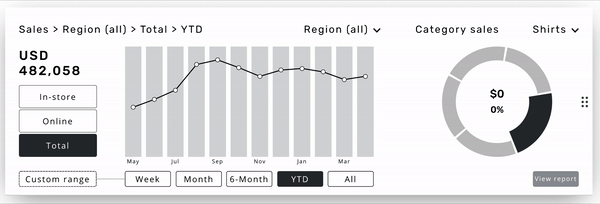
Sales section:
The ‘sales overview’ and ‘sales category’ given priority placement, and user ability to slice data in frequently-sought ways
2
Next season trends section:
Intended to give the user a quick overview of product trends at a glance, while being able to pivot each detail through the top-right corner
3
Interest match section:
Products from existing lookbook are featured here, displayed dynamically based on trends being monitored in the above section
4
Assortment planning section:
intention is to provide a side-by-side view of the current assortment of the retailer with “future assortment” of the retailer based on recent orders

5
5
Filter “drill-down flow” :
Users responded very positively to having the right-hand filters ordered starting with seasons - which they often use as the beginning point of their search, then price, then color
.png)
7
6
6
Visual filter via map:
Intended to provide the user with a quick and intuitive way to filter down a list of top zip-codes (first state, then city)
7
Images consumers resonate with:
A simple ‘add’ button was added so that users can add images to their collection of saved items
.png)
8
9
8
Insights category selection:
Intended to provide the user a quick way to flip through product, consumer, and brand insight categories, made large enough as to not be missable at the top
9
Full-length trend visualization:
Intended to make full use of horizontal real estate of the page, especially important for color types with a wide range of variations (e.g. ‘Blue’ with 18 variations)
Final Prototype

Usability test interview (Round 3)

Interviewee: Derek | Customer success manager for an analytics company
Interviewers: Mike
In total, we conducted 6 user interviews. Since it was a long weekend, we had trouble scheduling user interviews. It literally was our panic moment because, within the next 2 days, we need to hand over the project to the clients. Within one day, as a team, we completed all the user interviews successfully and we gave 5 tasks for the users to complete to see whether it's understandable or not.
Listed below are the key takeaways.
Quantitative results

Average completion and error rates (by task)
Quantitative results

-
Often heard ‘Easy’ after the completion of tasks.
-
Users who struggled with a task still rated highly and mentioned ‘the steps were easy’
-
Users navigated the product differently and got to the same result.
-
Some users reported confusion over site terminology.
-
Make interactions even more obvious where possible.
Quotes from usability testing
“Everything was clear, easy to navigate, good user experience“
- Janice (Buyer for Ann Taylor), in reference to overall product satisfaction
“Feels familiar... and good for a user who is not tech-savvy”
- Melissa (Buyer/Vendor), in reference to the entire product ease of use
Guess we achieved the goal!
We also did some extra work for our client which are listed below
Came up with Micro-interactions to show the clients how the live site works
We created a Vendor’s page too since there was feedback that it would be easier if there were separate pages for vendors and merchandisers.
Vendor’s information update page
.png)
Adding retailer version of Sales, Next year’s trends & brand to watch
Vendor’s dashboard

Adding extra columns such as
‘Target Audience’ & ‘Retailers’.
Vendor’s Your Store page

Adding products Numbers of order, Save to order rate, and total units.
Vendor’s wireframes
Next Steps
-
Build out vendor flow
-
Ability to switch between Vendor and Retailer within the platform
-
Build out responsive mobile based on 12-column grid set-up
-
Expand on data cards available for the dashboard - Responsive Design
-
A/B test label naming conventions and navigation for ease of use/recognition
What I learned
A few of the pointers that I learned from this activity is that the more interviews are conducted, the more insights we receive for the brief. The Filter option seems to be universal and is always understandable on multifarious platforms. Product score is the most significant factor for the fashion apparel industry.
What I may do differently
Within the 4 week duration, we tried the best way to solve the problem and come up with the right decision and client needs. I believe we did whatever we could in the given timeframe and efficiently handled this project. As learning from this project, we need to focus on getting more user interviews which would eventually help in yielding better results.
Conclusion
We added new features such as top filters, easily understandable graphs, a better-structured dashboard, lookbook, and insight section. Our final product was appreciated by our users and they feel it's much easier and better streamlined. This thereby shows that we achieved the goal and we created a better user experience on the platform which makes it easy for a time-crunched executive to quickly get the information they need.